Cookie consent banners need improvement, may not be the answer
By Ryan Noone
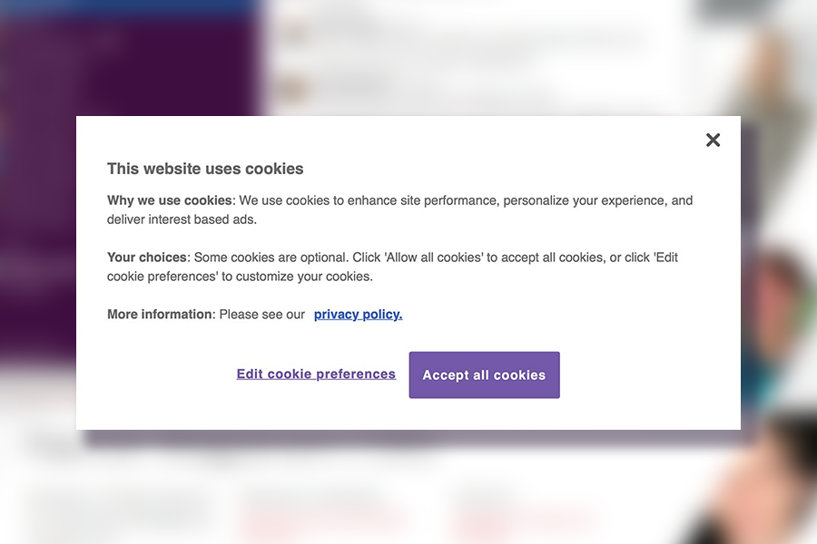
By now, you’re probably familiar with cookie consent banners, as they appear, in some form, on nearly every website you visit. But do you know what you’re agreeing to when you select one of the available options or click the x button to dismiss the interface?
Over the past several years, websites have begun implementing cookie consent banners to meet regulatory requirements, allowing users to make choices about how their personal information is collected and shared. However, according to researchers at Carnegie Mellon’s CyLab Security and Privacy Institute, many of these banners are missing the mark and may not be the best way to offer users privacy options.
“The primary issue with cookie consent interfaces has been the dark patterns that have proliferated them,” says Hana Habib, special faculty instructor and associate director of the CMU Software and Societal Systems Department’s Masters in Privacy Engineering program. “In other words, people were being steered towards less privacy protective choices.”
“Our prior work has made progress in terms of highlighting these patterns and has helped inform legislation, which now explicitly bans the use of dark patterns in consent interface designs.”
In a new study, ‘A US-UK Usability Evaluation of Consent Management Platform Cookie Consent Interface Design on Desktop and Mobile,’ which was presented at the 2023 ACM CHI Conference on Human Factors in Computing, CyLab researchers explore how users in both the U.S. and U.K. interact with and perceive cookie interfaces, examine how those interactions and perceptions differ on desktop and mobile devices, and look to understand how banner prominence, location of cookie category definitions and initial cookie options impact users attitudes and behaviors.
Over 1,350 participants were directed to complete a distraction task on a simulated e-commerce website. Each encountered one of 14 cookie consent interfaces using the OneTrust Consent Management Provider (CMP). Some offered a range of privacy options on the initial screen, while others forced users to navigate to a secondary screen to avoid accepting all cookies. Researchers also included interfaces that allowed users to explore definitions related to each cookie option. Upon completing the task, participants were asked to take a survey, evaluating various cookie consent usability goals.
“Our findings show users are unlikely to navigate to secondary screens to make privacy choices, so we recommend a design that includes a full range of options in the initial interface,” says Elijah Bouma-Sims, Ph.D. student in CMU’s Software and Societal Systems Department. “At a minimum, it’s important that banners include at least two options, ‘accept all cookies’ and ‘reject all cookies.”
Their findings also reveal that users have mixed notions about what happens when they click the close or ‘x’ button at the top right corner of these interfaces, as some participants believed they were rejecting all cookies.
In the U.K., national laws require the close button to result in accepting only necessary cookies; however, in the U.S., closing the interface usually results in accepting all cookies. Surprisingly, results showed U.K. users were less likely to dismiss the cookie notice using the close button, even though it yielded a more favorable outcome.
“Websites aren’t getting users' informed consent by allowing them to close out of the notice, so we suggest removing that option,” says Bouma-Sims. “However, if a close-out option is present, it should be accompanied by text indicating its functionality.”
The study’s results show mobile users are more likely to accept all cookies, which the authors believe may result from the amount of real estate the banners take up on smaller screens. Researchers say developers should look to make interfaces more usable on mobile devices rather than implementing a one-fits-all approach.
Additionally, the inclusion of definitions did not improve user comprehension, as researchers hypothesize most participants did not take the time to read them.
Overall, researchers say cookie consent banners should be standardized and include more intuitive terms for cookie categories; however, they note there may be better approaches for capturing user consent, such as enabling users to make privacy choices within their browser, which would then be applied to each website they visit.
“We conducted this study with the interest of improving the design of current cookie consent banners, but in the longer term, we believe there are better solutions,” says Bouma-Sims.